by Mary Shipp
About the
Author
Mary Shipp is the author of several
needlework books, as well as a designer and teacher. Her most
recent book is Design for Embroidery; she is also the author
of Color for Embroidery and several books on various embroidery
techniques. These volumes have established her reputation for
clear diagrams and good verbal descriptions. Mary's objective
as a teacher is to develop materials that will encourage students
to experiment with color, thread and stitches, and discover that
they, too, can create needlework designs. Out of her teaching
materials have come a number of smaller booklets, one of which,
Stitching with Overdyed Thread, features various variegated threads
from The Caron Collection. We urge you to support the designers
who are contributing the outstanding free classes and features
you see at this site. Click here for
information on ordering Mary's books and booklets.
More About
Color for Needleworkers
In Part One of this two-part
article, which appeared in October, l999, we learned a few basic
color terms and discussed the traditional color chords or color
harmonies. We proved that theoretically all colors "go with"
each other, and I made the statement, "...every color 'goes
with' every other color, as long as you have a pleasing combination
of hues tints, tones, and shades." Before we discuss color
contrast, which is really all about combinations of hues,
tints, tones, and shades, we should take a little digression
and look at the two types of tones.
Earlier I mentioned that some color writers
do not even use the term "tone", which refers to a
color that has been adulterated either by gray or by the color's
complementary color. I said that not only did I prefer to use
this term but that I felt that the difference between the types
of tones was important enough to make the distinction.
 In
the illustration at the right, I have taken the six primary and
secondary colors and added white to create tints, black and white
to create grayed tones, the complement of each color to make
complementary tones, and black, to make shades. In each case,
I have added the same amount of the adulterating color(s) to
every hue. As you see, adding a small amount of black, for example,
makes a great difference to the lighter hues such as yellow,
and very little difference to a darker hue like blue. Darker
colors have more tinctorial power than light colors. This
is a fact that dyers have to remember; those of us who do not
work dyes can merely register the information and move on.
In
the illustration at the right, I have taken the six primary and
secondary colors and added white to create tints, black and white
to create grayed tones, the complement of each color to make
complementary tones, and black, to make shades. In each case,
I have added the same amount of the adulterating color(s) to
every hue. As you see, adding a small amount of black, for example,
makes a great difference to the lighter hues such as yellow,
and very little difference to a darker hue like blue. Darker
colors have more tinctorial power than light colors. This
is a fact that dyers have to remember; those of us who do not
work dyes can merely register the information and move on.
 Now
let us compare the two types of tones. For the grayed tones I
added a small amount of black to the color in the tint column.
(Each tint already contained white; all I had to do was add the
black to create a grayed tone. For the complementary tones I
added to red a small amount of green (yellow + blue); to yellow
I added a small amount of violet (red + blue); to blue I added
a small amount of orange (yellow + red), etc. Notice that in
each case, we end up using all three primary colors in each complementary
tone. The ultimate version of this type of addition is shown
below; when we add equal amounts of all three primary colors,
we create gray. In actual practice using dyes instead of colors
on a computer screen, the complementary tones often come out
looking somewhat brownish. There are some lovely and some decidedly
unusual looking colors in this group of tones. Observe, for example,
what happens to a tint of violet when it is turned into a complementary
tone. These colors are often more lively than the grayed tones.
Generally speaking, people either love these complementary tones
or they hate them.
Now
let us compare the two types of tones. For the grayed tones I
added a small amount of black to the color in the tint column.
(Each tint already contained white; all I had to do was add the
black to create a grayed tone. For the complementary tones I
added to red a small amount of green (yellow + blue); to yellow
I added a small amount of violet (red + blue); to blue I added
a small amount of orange (yellow + red), etc. Notice that in
each case, we end up using all three primary colors in each complementary
tone. The ultimate version of this type of addition is shown
below; when we add equal amounts of all three primary colors,
we create gray. In actual practice using dyes instead of colors
on a computer screen, the complementary tones often come out
looking somewhat brownish. There are some lovely and some decidedly
unusual looking colors in this group of tones. Observe, for example,
what happens to a tint of violet when it is turned into a complementary
tone. These colors are often more lively than the grayed tones.
Generally speaking, people either love these complementary tones
or they hate them.
Most of us do not dye our own thread, so
much of the discussion in this article may seen pointless to
you. "I don't mix colors," you may say. "What
does this have to do with me?" In addition to Lois Caron's
discussion of optical mixing (to be found in the archives),
consider the "in between" areas on your favorite
variegated or hand-dyed thread. Here, in areas where purer colors
blend together, one often finds tones. When I am designing a
color scheme using variegated or hand-dyed thread I often can
match this tone to a solid color from another type of thread.
This gives me a totally unexpected color to use in the composition,
and this unexpected color is often the one that gives the composition
that special little kick that raises it from a so-so color
scheme to something special.
 Before
we move on to backgrounds and contrast, I urge you to collect
as many gray threads as you own, and place them side by side.
You will be amazed at how different they appear. This is because
some of them contain a tiny bit of red, or yellow, or blue, and
some were created using only a dilute black dye. These latter
are the true neutral grays; the others are not. See the examples
at the right. We need to be aware that gray thread is not always
pure gray, when using it in a composition. If you don't like
the way a particular gray looks in a design, try a different
family of grays.
Before
we move on to backgrounds and contrast, I urge you to collect
as many gray threads as you own, and place them side by side.
You will be amazed at how different they appear. This is because
some of them contain a tiny bit of red, or yellow, or blue, and
some were created using only a dilute black dye. These latter
are the true neutral grays; the others are not. See the examples
at the right. We need to be aware that gray thread is not always
pure gray, when using it in a composition. If you don't like
the way a particular gray looks in a design, try a different
family of grays.
Contrast
 We
will ease our way into a discussion of contrast by looking at
backgrounds, which are much more important to a piece of embroidery
thanmany stitchers realize.
We
will ease our way into a discussion of contrast by looking at
backgrounds, which are much more important to a piece of embroidery
thanmany stitchers realize.
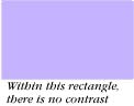
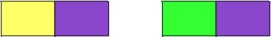
What is contrast? Contrast means difference.
To have contrast, or difference, you must have two things to
compare. In the lavender rectangle, there is no contrast of any
type. There is contrast between the lavender rectangle and the
background of your computer screen, but that is not the issue
here.
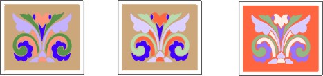
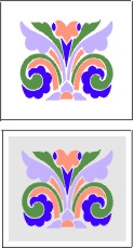 In
the examples at the right, the same design is shown against a
white and a neutral gray background. The colors in each design
are exactly the same. We are talking here about contrast between
the background and the colors in the design. Within the design
itself there is plenty of contrast.
In
the examples at the right, the same design is shown against a
white and a neutral gray background. The colors in each design
are exactly the same. We are talking here about contrast between
the background and the colors in the design. Within the design
itself there is plenty of contrast.
There is a great deal of contrast between
the design and the white background; some people might feel that
there is too much. Against the white background the colors seem
strong and vital; notice how much softer they seem against the
gray below, although the colors in the design are precisely the
same. The gray background, since it is very light, provides some
contrast with the colors in the design, although the colors appear
subdued against the gray as compared to the way they look against
white. Against the black background shown at the left below,
while the overall composition is very dramatic, the hue of blue
violet is lost because there is not enough contrast between the
blue violet hue and the black.
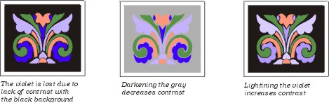
If we are dissatisfied with the way our
chosen colors look against a particular background we can change
one of two things, the background or the colors. We might guess
that using a darker gray (center above) would brighten up the
colors, but notice what happens when the gray background is darkened.
This is not a successful change, because the colors fade even
more than they did against the lighter gray. If we want to use
black for the background, we will have to lighten some of the
colors. They can be easily modified as shown at the far right,
where both the hue and the tint of blue violet were lightened.
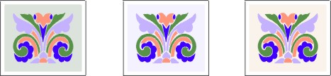
Next we look at examples where the backgrounds
are respectively pale tints of yellow green, blue violet, and
red orange. The red orange closely approximates ecru fabric.
Many stitchers like to use colored backgrounds, though others
prefer neutral colors (white, gray and black) or very pale earth
tones, such as ecru, ivory or beige. This is a matter of personal
preference.
If a colored background is chosen it must
be light enough to provide good contrast with the colors in the
design. Notice in the row immediately above what happens when
a darker tone of red orange is used in the background; on the
left, the red orange tint in the design is lost; in the center
example, the middle value colors have been lightened to contrast
with the background. The dark colors already contrast well enough.
In other compositions, the background fabric
may be much darker than the threads used. This type of design
is akin to a photographic negative, and can be very dramatic.
In any case there must be considerable contrast between the design
and the background. See the final example above.
 In
all of these examples we have been talking about contrast of
value, or contrast between light and dark. The design itself
has contrast of color, and was created to have enough contrast
of value within itself.
In
all of these examples we have been talking about contrast of
value, or contrast between light and dark. The design itself
has contrast of color, and was created to have enough contrast
of value within itself.
In addition to contrast of value, there
are other types of contrast to be considered when coloring a
design. They are, contrast of hue, contrast of intensity (saturation),
contrast of extent, and contrast of temperature. Some authors
mention complementary contrast plus simultaneous and successive
contrast. Complementary contrast, in my opinion, is sufficiently
covered by contrast of hue, and successive and simultaneous contrast
are very technical and beyond the scope of this article. This
leaves us with five types of contrast, shown in bold face type
in this paragraph.
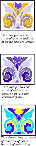
Each of the examples given at the right
show one or more types of contrast, as pointed out by the captions.
Not every design contains all the different types of contrast.
Generally we try to emphasize one or two of them. Some of the
others will sneak in through the back door.
Contrast of hue is obvious in the second
example, where blue violet is paired with its complementary color,
yellow orange. The complementary color chord will always give
you the greatest contrast of hue. This is why I feel that complementary
contrast is nothing more than a special case of contrast of hue.
The design also has contrast of value and contrast of saturation.
Since the next example is a monochromatic
design, there can be no contrast of hue. Contrast of value and
contrast of saturation are present however. Different intensities
(saturations) of blue violet create the contrast of value (lightness/darkness).
Compare this with the next example, which is made up of a high
value hue (yellow ) a medium value hue (blue green) and a low
value hue (blue violet) all of which are, by definition, fully
saturated. There is no contrast of saturation, but there is contrast
of hue and contrast of value. The design is also very garish,
which is no surprise, because of the lack of tints, tones, or
shades.
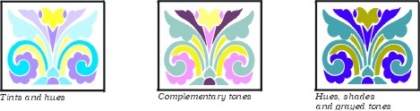
Thus far we have covered contrast of value,
hue, and of saturation, and we have created some very different
effects in the same design. If we like bright pure colors we
can use hues and tints, as is shown in the design at the left
below. If we like really subtle effects, we can try complementary
tones, as shown in the center. If we like drama, we can contrast
hues and/or tints and shades, as shown at the right. This is
what is meant by "a pleasing combination of hues, tints,
tones and shades." Remember, it has to be "a pleasing
combination" for you, not for someone else.
 There
are two types of contrast remaining, contrast of temperature
and contrast of extent.
There
are two types of contrast remaining, contrast of temperature
and contrast of extent.
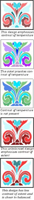
Contrast of temperature is dependent upon
hue. In simplified terms, the warm colors are red, orange, and
yellow, and the intermediate colors in between, and the cool
colors are green and blue and the intermediate colors between
them. What about violet? Well, that depends on the company that
violet keeps. In the examples below, the violet rectangles are
exactly the same color. To me, the one next to the yellow rectangle
looks cooler than the one next to the green rectangle. This is
quite subtle, and you may not agree with me, which is just fine.
Comparing color temperature is a very subjective thing, and in
the long run, when people disagree it is nothing to worry about.
The design at the top right has considerable
contrast of temperature, since it is made up of tints, tones,
and shades of the hottest color and the coolest color on the
color wheel. Contrast of temperature is important when a design
is too cool, or too warm. Once again, this is to a large extent
a matter of personal preference. The second and third designs
are very similar. In the top example of this pair, the violet
"warms up" the design to quite an extent. For some
people, or for some uses, this might be considered "better"
than the other one, where the cool colors are unrelieved by any
warm colors at all. Other people might fall madly in love with
the lower design, or they might prefer it under certain circumstances-for
example on a pale lemon colored wall.
The final type of contrast we will cover
here is contrast of extent. Extent has to do with balance, and
emphasis, two other components of design. While we are talking
more about color theory in this article than we are about design
theory, we know that these two branches of art have to work together
to create an attractive piece of needlework.
Extent refers to the amount of area covered
by each color in the design. Extent is difficult to calculate
in any design that deviates from a checkerboard, especially when
the intensity of the various tints, tones, and shades of the
various colors come into play. According to one early color theorist,
if it was necessary to rely on mathematical formulas to insure
that a design was balanced, one should do so. Fortunately, that
is an outdated notion in most design circles. Not every design
needs to be balanced in the first place, and if we do want balance,
we can rely on our eyes, rather than algebra, to make it so.
The next two designs exhibit non-balance
(the upper one of the pair) and near-balance. The difference
is that in the top one there is greater contrast of extent, which
creates the lack of balance. There is much more design area covered
by various tints, tones and shades of red orange than there is
of blue green. In the lower one, the areas covered by the two
colors are closer to equal, so that there is less contrast of
extent, and more balance. Note how fragmented the lower of the
two designs appears. This is a difficult design to balance for
extent, especially with these two colors.
Please remember that all of the various
color treatments you see in this article and the previous one
are purposely exaggerated to emphasize a particular point. Not
all of them are what I would consider attractive compositions.
We use contrast of extent as one way to
establish an area of emphasis. Remember that contrast means different.
In a design, the area that is different in some way will be the
area that attracts people's attention. With regard to color,
this is the area that is the brightest, the lightest in a dark
composition or the darkest in a light composition, the warmest
in a cool composition or the coolest in a warm composition, etc.
Now 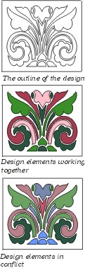 analyze
an outline version of the design we have been using in this article.
It is a stylized plant with a flower. One assumes that the flower
is to be the focal point (area of emphasis); this is what we
might call a context clue. When we look at the design, we see
that most of the lines flow generally upward; they carry the
eye toward the flower, which is the highest point in the design.
Additionally, this is the only flower in the motif, while most
of the other shapes are paired on either side of the vertical
center. Because of context (the ultimate purpose of a flowering
plant is its flower), height, uniqueness, and direction of line,
the flower stands ready to receive the most attention-getting
color in the design. We have done this in the first colored example
at the right. The color here is lighter and warmer than the other
colors. Two lines of the same color lead our eye more up than
out. The design is in harmony with itself.
analyze
an outline version of the design we have been using in this article.
It is a stylized plant with a flower. One assumes that the flower
is to be the focal point (area of emphasis); this is what we
might call a context clue. When we look at the design, we see
that most of the lines flow generally upward; they carry the
eye toward the flower, which is the highest point in the design.
Additionally, this is the only flower in the motif, while most
of the other shapes are paired on either side of the vertical
center. Because of context (the ultimate purpose of a flowering
plant is its flower), height, uniqueness, and direction of line,
the flower stands ready to receive the most attention-getting
color in the design. We have done this in the first colored example
at the right. The color here is lighter and warmer than the other
colors. Two lines of the same color lead our eye more up than
out. The design is in harmony with itself.
Now look at third illustration. As mentioned
earlier, fragmentation, as evident here, does not help us understand
a design. We have three colors, scattered in various places.
The blue is especially fragmented, and the brightest blue is
at the bottom, which pulls the eye away from the flower rather
than toward it. If, for all the logical reasons listed in the
paragraph above, the flower is the area of emphasis, why is the
brightest, most attention-grabbing color in the design at the
bottom of the plant near the roots? Here color does not reinforce
the area of emphasis, it distracts from it. The composition is
less successful because of the lack of a coherent area of emphasis.
In the first of these two articles about
color for needleworkers, I demonstrated that there was no "magic
formula" or set of rules that governed color combinations.
Just as in a rainbow, all colors are in harmony with each other.
The rainbow is the source of all hues.
A rainbow, however, is appreciated for
its rarity. A successful design of pure hues is also rare. In
real life and in needlework design, we tend more often to use
tints, tones, and shades. Contrast between hues, tints, tones,
and shades is an important factor in the application of color
to a design. There are many types of contrast; they vary in their
importance in a particular composition.
In the past two or three centuries we have
moved from a set of rules and formulas with regard to color to
an appreciation of color in all its forms. It is appropriate
that as we close this century and look ahead to the next we realize
that personal preference, as opposed to someone else's opinion,
should be the determining factor when choosing color for a composition.
My short way of saying this is, "If you like it, use it."
If you do not like it, but are not sure what to do to fix it,
a little knowledge of color theory comes in very handy. This
is when modern-day color theory comes to the rescue. Other than
that, enjoy the world of color, as opposed to worrying about
breaking the rules.
Ordering Mary
Shipp's Books
Mary Shipp teaches at EGA and ANG Guilds,
needlework shops, the Rockome Illinois Cross Stitch Festival,
and other needlework events. Her main occupation is as an author
of self-published books on needlework, and of design booklets.
Her books, listed below, are available in needlework shops. Shop
owners may contact her at Stitches by Shipp, 7426 Fish Hatchery
Road, Bath, NY, 14810. (607) 776-2759, wholesale inquiries
only, please. Retail customers whose local shops do not carry
Mary's books may call The Golden Unicorn, Corning, NY (607) 776-2759;
Stitchery Row, Endicott, NY, (607)748-8003; Ellen Nell, Inc.,
Winston Salem, NC (800)499-1224; Ruth Kern Books, Phoenix, AZ
(606) 943-0738, or Hard-to-Find Needlework Books, Newton Center,
MA (617) 969-0942. All of these firms ship mail order and do
charge orders.
Books by Mary D. Shipp:
Stitches for Counted Thread Embroidery, 1995. A two-volume stitch encyclopedia, describing
over 250 stitches in clear, easy to read format. 626 pages total.
Sold only as a two-volume set, $64.75 per set, plus postage.
Color for Embroidery, 1997. This book contains two sections, Part 1,
a discussion of color theory in general terms with color illustrations.
Part 2, color theory as applied directly to embroidery, with
detailed examples. 130 pages, $49.75, plus postage.
Exploring Pattern in Stitches, l997. Presents a discussion of techniques used
to develop diaper and other all-over patterns in any counted
technique. Includes over fifty sample patterns with variations,
plus a short discussion of color. 87 pages. $26.50, plus postage.
A New Look at Blackwork, 1998. Chapters on several Blackwork techniques,
as well as the history of Blackwork. Over 25 different stitches
used in Blackwork are clearly and comprehensively diagrammed.
Directions for 5 different projects are included, plus many diagrams
and pictures of actual stitched examples. 102 pages, $27.50,
plus postage.
A New Look at Borders and Bands, 1998. Discusses the component parts of a border
and how they work together to make a well-designed whole. Turning
corners and making a border fit into a predetermined space is
covered, as well as the use of various stitches, color, and texture.
61 pages. $26.50, plus postage.
Design for Embroidery, 1999. This book is the companion to Color for
Embroidery, although it may also stand alone. The first two
parts of the book cover the elements and principles of design.
The final part shows how to apply design theory to embroidery.
Color and black and white illustrations, a glossary of terms,
and several specialized bibliographies are included. Completely
indexed, 150 pages. $49.75, plus postage.
Stitching with Overdyed Thread, 1998. This is a 30 page booklet, as opposed to a book.
It is full of color pictures showing experiments to teach you
how to get the most from variegated threads of any type, and
covers a number of different stitching techniques. Includes two
projects, with stitch diagrams for all stitches called for. $19.95,
plus postage.
Other booklets: At
the present time, Mary has a total of 20 booklets available,
ranging from "How to Do Cross Stitch" and "Stitching
on Linen" to a reproduction of an 1808 sampler, and a Florentine
Stitch pillow. For a color catalogue of all Mary's publications,
send a check for $3.00 to Stitches by Shipp, 7426 Fish Hatchery
Road, Bath, NY 14810. Your $3.00 will be refunded with your first
$20.00 order. No phone or charge orders for catalogues, please.
COPYRIGHT NOTICE: This feature is for the personal
use of our web site visitors only. No part of this feature story
nor the included designs can be reproduced or distributed in
any form (including electronic) or used as a teaching tool without
the prior written permission of Mary Shipp.